Well, that's it I guess.
Now, where to start...
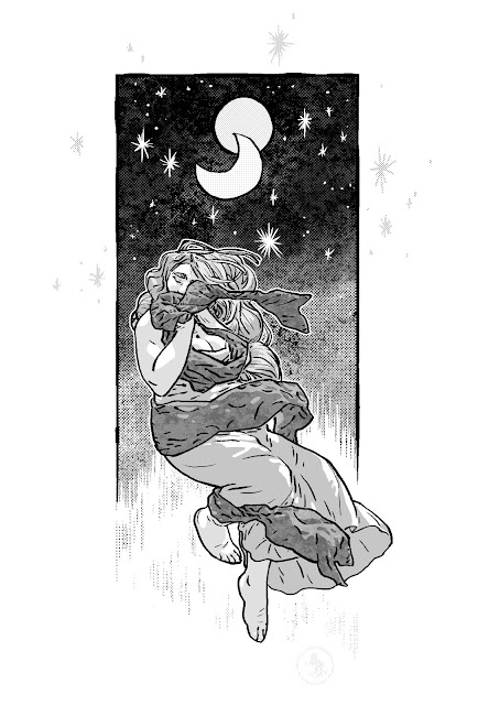
Calamity Cash and the Town with No Name is finished. Completely finished. I don't want to think about how long I've been working on it. To put it in perspective, when I started, I was single and living with my parents. Having finished it, I'm married and living in my own house.
As a final recap- I asked Randall if he had something (a story) he'd like to have drawn. I wanted to practice on something, but wanted to be removed from the story part. Sort of see if I could get into something that I wasn't really invested in, and, if what I was doing was bad, and because it was their story, there was someone other than myself to tell me that it was. I remember being pretty adamant about it being for practice and not to expect too much (hindsight= thank God). I think the initial page count was 46.
Randall wrote a script (anything he wanted, from what I remember telling him), and I eventually started on it. Pretty early on, it was clear that I had no idea what I was doing.
I guessed at how to do things. I think it wasn't until page 12 or 13 that I stopped guessing at dialogue balloons and started to plan and measure them out, instead of trying to squeeze or expand text to fit guessed balloons. And even then, I didn't really start getting that right until around the 30's.
If nothing else, this book is a compendium of mistakes. I started with the idea that it would be better to use the cheapest, most basic tools. So, I used the cheapest paper and pens I could buy at office stores. The only problem with that is that the crapiest paper is the crapiest.
The paper I used for more than half of the comic has a very waxy finish. I'm not sure what it really is, but it's like the paper has a very thin layer of paraffin wax on the surface. And when you erase on one spot more than once, the wax rubs off and the paper on that spot starts falling apart. And, in the beginning, I used 'professional' drafting blue lead. The problem with that is it's very waxy too and it's basically not erasable. Also, ink doesn't stick very well to either waxes.

I stopped using that paper at about page 30, I think. And I stopped using that waxy pencil. Now I use Crayola erasable colored pencils. And I can't decide whether it's funny or appalling that Crayola makes the best colored pencils available. They're seriously far better than the world's most expensive "erasable" colored pencils from "real" art supply makers- master craftsmen companies making stuff since 1760 or whatever.
Another problem I started having was that I was getting better. And that's not bragging, I was horrible at the start of this thing. It was clear at about page 23 or 24, that the first half of this thing wasn't going to be printed.
The further along I went, the better and more different my drawing became. The character models I did at the beginning were getting further and further from the way I was starting to draw. A problem through the comic, I think, is that the characters, when the pages are all slapped together in a book, always seem off model. I tried to make the characters look sequentially the same, but I wasn't all too successful. If you ask anyone that draws sequential images, the hardest thing is making every character look like themselves- keeping them on model. This probably wouldn't have been hard to do if I'd finished this in a month or two, but sometimes I wouldn't work on this for months. I think the longest span of not working on it was 8 or 10 months.
Then I'd go back to working on it, and find I could draw the character better. So, from page to page the character changes, and that's not so much as me not being able to keep the characters on model, it's me having to use models that weren't like how I was drawing. ...I guess the characters kept evolving as the book went along. I accepted it somewhere along the way that it was bound to happen, the whole point of this, for me, was to get better.
Another problem with working on it sporadically between months was consistency. Between months of basically not even seeing pages, I'd forget little things. Like where exactly bandages should be, or who was exactly standing where. If anyone finds an inconsistency, don't worry- I guarantee I've already found it when I was toning all the pages.
I also invented shotgun toning while finishing this. To go into details would be long and arduous, but basically, put as tones down as fast as possible, cut your loses, and move on. I toned 7 pages in one day. And these pages aren't splash pages.
That was another problem. Maybe problem is too strong a word. How about- project defining obstacle? There is a lot crammed into this comic. This comic, given a normal comics' pacing and one/two page spread usage, could have easily been a 4 or 6 issue series. But, I digress.
This was a learning process, and I decided, about halfway through, that the first 20 or so pages were horrible looking. And they were. And it wasn't until about halfway through that I learned I'd processed them incorrectly. What looks good onscreen, especially line art, doesn't mean it looks good printed.
It wasn't too soon after that that I had a computer accident (despite what it sounds, not on purpose). I'm not sure what happened, but somehow I lost all of the files up to where I was at with the comic (pages 1 through about 25 were gone). I'd gotten a new computer and my guess is somehow those files weren't transferred, then the hard drive was formatted. So that especially didn't make me want to print the first half, because I'd have to scan and tone all those pages I thought were horrible in the first place.
Anyway, things went on and eventually, I quit the job I had previously had to have. The remaining (2, I think) pages I drew went by pretty quickly- 2 or 3 days. Then a weekend. Then I inked pages 29 to 45 in about 5 days. Then a weekend. Then another week to tone. Weekend. The cover and design work and an extra page.
We decided that since we weren't printing the first half, an additional recap page would be needed to follow what was happening at all. The last page (now page 1) took less than 24 hours from thumbnailing to completely finishing. Even though it's a pretty simple page, no bells or whistles, it gave me a pretty good idea at where I stood, time-wise. If I absolutely had to, I could probably get about 3 pages like that drawn in a day, as long as they could be simple and loose like that. I mean, I know quality suffers, but I know I could if I had to.
Now that it's finished, one problem that the comic has is it's printing. When I was working on that sketchbook I made, I found out that tones and line art are problems for digital printers. With line art, especially with halftones like that, the minimum resolution for printing should be 600dpi. Minimum. When comics with tone are printed, especially Japanese comics, the resolution is a minimum of 1200dpi. Sometimes 2400dpi, if the image has been reduced from a larger original size.
Digital printers print at 300dpi. Which means the art is larger and clunkier than it should be. And the dots that make up the tones are much larger than they should be- they're as big or bigger than the lines that make up the line art, so they contend with the lines instead of accentuating and complimenting them.
But there's nothing I can really do about that. That's just one of the many bullets I've had to bite and move one.
I am lucky though, because there are correct ways and incorrect ways of toning, and I've learned the difference. You can't resize tones. They have to be made correctly from the start at print size- especially at 300dpi. I'm lucky I made the sketchbook first; I'm glad I messed up a drawing I don't particularly care about instead of 23 pages that I'd have to go back and redo.
I have the knowledge to wield my stuff almost masterfully now. I know exactly what my scanner can and can't do. I know what photoshop can't fix. I know more inherent limitations of what I was using and what I'm using now.
I have a specific process that I can stick to. Everything I use, I use for a specific reason. Almost nothing is superfluous. Except this:


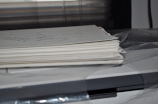
You wouldn't think 45 pages would be that thick.
Calamity Cash and the Town with No Name is finished. Completely finished. I don't want to think about how long I've been working on it. To put it in perspective, when I started, I was single and living with my parents. Having finished it, I'm married and living in my own house.
As a final recap- I asked Randall if he had something (a story) he'd like to have drawn. I wanted to practice on something, but wanted to be removed from the story part. Sort of see if I could get into something that I wasn't really invested in, and, if what I was doing was bad, and because it was their story, there was someone other than myself to tell me that it was. I remember being pretty adamant about it being for practice and not to expect too much (hindsight= thank God). I think the initial page count was 46.
Randall wrote a script (anything he wanted, from what I remember telling him), and I eventually started on it. Pretty early on, it was clear that I had no idea what I was doing.
I guessed at how to do things. I think it wasn't until page 12 or 13 that I stopped guessing at dialogue balloons and started to plan and measure them out, instead of trying to squeeze or expand text to fit guessed balloons. And even then, I didn't really start getting that right until around the 30's.
If nothing else, this book is a compendium of mistakes. I started with the idea that it would be better to use the cheapest, most basic tools. So, I used the cheapest paper and pens I could buy at office stores. The only problem with that is that the crapiest paper is the crapiest.
The paper I used for more than half of the comic has a very waxy finish. I'm not sure what it really is, but it's like the paper has a very thin layer of paraffin wax on the surface. And when you erase on one spot more than once, the wax rubs off and the paper on that spot starts falling apart. And, in the beginning, I used 'professional' drafting blue lead. The problem with that is it's very waxy too and it's basically not erasable. Also, ink doesn't stick very well to either waxes.

Here's a waxy sheen from the pencil- the paper's sheen doesn't pick up well by camera. Normally, ink dries with a matte finish.
I stopped using that paper at about page 30, I think. And I stopped using that waxy pencil. Now I use Crayola erasable colored pencils. And I can't decide whether it's funny or appalling that Crayola makes the best colored pencils available. They're seriously far better than the world's most expensive "erasable" colored pencils from "real" art supply makers- master craftsmen companies making stuff since 1760 or whatever.
Another problem I started having was that I was getting better. And that's not bragging, I was horrible at the start of this thing. It was clear at about page 23 or 24, that the first half of this thing wasn't going to be printed.
The further along I went, the better and more different my drawing became. The character models I did at the beginning were getting further and further from the way I was starting to draw. A problem through the comic, I think, is that the characters, when the pages are all slapped together in a book, always seem off model. I tried to make the characters look sequentially the same, but I wasn't all too successful. If you ask anyone that draws sequential images, the hardest thing is making every character look like themselves- keeping them on model. This probably wouldn't have been hard to do if I'd finished this in a month or two, but sometimes I wouldn't work on this for months. I think the longest span of not working on it was 8 or 10 months.
Then I'd go back to working on it, and find I could draw the character better. So, from page to page the character changes, and that's not so much as me not being able to keep the characters on model, it's me having to use models that weren't like how I was drawing. ...I guess the characters kept evolving as the book went along. I accepted it somewhere along the way that it was bound to happen, the whole point of this, for me, was to get better.
Another problem with working on it sporadically between months was consistency. Between months of basically not even seeing pages, I'd forget little things. Like where exactly bandages should be, or who was exactly standing where. If anyone finds an inconsistency, don't worry- I guarantee I've already found it when I was toning all the pages.
I also invented shotgun toning while finishing this. To go into details would be long and arduous, but basically, put as tones down as fast as possible, cut your loses, and move on. I toned 7 pages in one day. And these pages aren't splash pages.
That was another problem. Maybe problem is too strong a word. How about- project defining obstacle? There is a lot crammed into this comic. This comic, given a normal comics' pacing and one/two page spread usage, could have easily been a 4 or 6 issue series. But, I digress.
This was a learning process, and I decided, about halfway through, that the first 20 or so pages were horrible looking. And they were. And it wasn't until about halfway through that I learned I'd processed them incorrectly. What looks good onscreen, especially line art, doesn't mean it looks good printed.
It wasn't too soon after that that I had a computer accident (despite what it sounds, not on purpose). I'm not sure what happened, but somehow I lost all of the files up to where I was at with the comic (pages 1 through about 25 were gone). I'd gotten a new computer and my guess is somehow those files weren't transferred, then the hard drive was formatted. So that especially didn't make me want to print the first half, because I'd have to scan and tone all those pages I thought were horrible in the first place.
Anyway, things went on and eventually, I quit the job I had previously had to have. The remaining (2, I think) pages I drew went by pretty quickly- 2 or 3 days. Then a weekend. Then I inked pages 29 to 45 in about 5 days. Then a weekend. Then another week to tone. Weekend. The cover and design work and an extra page.
We decided that since we weren't printing the first half, an additional recap page would be needed to follow what was happening at all. The last page (now page 1) took less than 24 hours from thumbnailing to completely finishing. Even though it's a pretty simple page, no bells or whistles, it gave me a pretty good idea at where I stood, time-wise. If I absolutely had to, I could probably get about 3 pages like that drawn in a day, as long as they could be simple and loose like that. I mean, I know quality suffers, but I know I could if I had to.
Now that it's finished, one problem that the comic has is it's printing. When I was working on that sketchbook I made, I found out that tones and line art are problems for digital printers. With line art, especially with halftones like that, the minimum resolution for printing should be 600dpi. Minimum. When comics with tone are printed, especially Japanese comics, the resolution is a minimum of 1200dpi. Sometimes 2400dpi, if the image has been reduced from a larger original size.
Digital printers print at 300dpi. Which means the art is larger and clunkier than it should be. And the dots that make up the tones are much larger than they should be- they're as big or bigger than the lines that make up the line art, so they contend with the lines instead of accentuating and complimenting them.
But there's nothing I can really do about that. That's just one of the many bullets I've had to bite and move one.
I am lucky though, because there are correct ways and incorrect ways of toning, and I've learned the difference. You can't resize tones. They have to be made correctly from the start at print size- especially at 300dpi. I'm lucky I made the sketchbook first; I'm glad I messed up a drawing I don't particularly care about instead of 23 pages that I'd have to go back and redo.
I have the knowledge to wield my stuff almost masterfully now. I know exactly what my scanner can and can't do. I know what photoshop can't fix. I know more inherent limitations of what I was using and what I'm using now.
I have a specific process that I can stick to. Everything I use, I use for a specific reason. Almost nothing is superfluous. Except this:

I think company logos on the actual product, not the packaging, of something you pay to own and use, especially work related, is stupid. Would you buy notebook or printer paper if it had the company's name, address, phone number, website to order more paper at, and company info at the top 8th of every single page? Probably not. You buy paper because you need paper, not giant company business cards. The common sense and logic part of my brain tells me they should be paying me to use this stuff, not the other way around.
Needless to say, I won't be buying branded paper again.
It took longer than I ever thought, but it's served its purpose. I learned stuff. And there's almost no other way to learn this stuff. I learned from others as much as I could, but nothing will teach you like digging in and doing it will.
Just about the only problem I'm having that I haven't gotten around, is that every so often when I'm using a pencil, I'll snag something in the lead. Like a piece of sand or something. It digs into the paper, scratching into the paper until the lead goes down enough for it to fall out. Like this-

And it seems to be happening more and more frequently. I'll probably try to switch to a more expensive pencil and see if that fixes it.
Anyway, that's about it. The only thing left to do is put in the first small order to have the thing printed.
And that's it. It's weird that I'll never have to work on this again.
It's done.