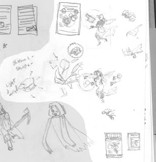
A few quick doodles from some tone tests.


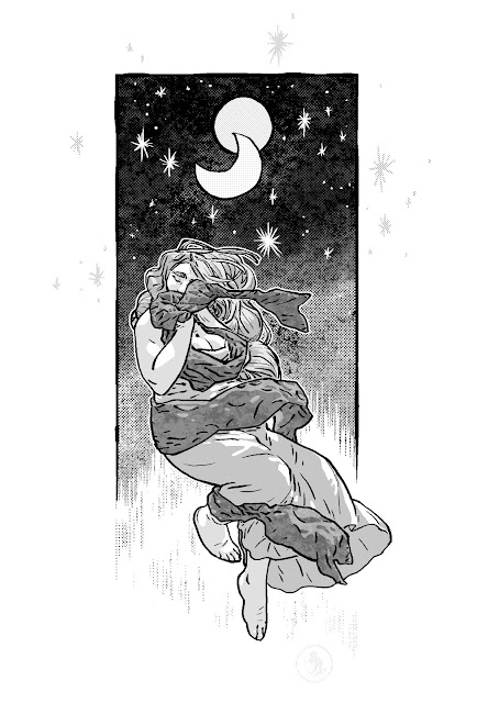
These were tiny doodles- just a couple inches. Not meant to be awe-inspiring, just something to try a few things on. One problem that I knew I was going to have, was that hair was going to be over the character's face pretty much the whole time. Covering your main character's face isn't generally a good thing, but I like long hair because it's fun to draw. Like, usually, I can use it as a cape, with wind, or weight, or whatnot.
Plus, there's no one here giving me orders or telling me I can't.
I try to do as much as I can in real life because I still hate doing this stuff on computer. I started using sharpies and tracing paper instead for the tones so that I could just copy and paste shapes, but I think it'll take a little getting used to.
I'm getting to the point where, if this process were a movie, Eye of the Tiger would've just started to fade in. The other day I bought the font I'm going to use. Before then, I was just going to use whatever was the best that I could find for free. I decided against it after really seeing how limited they were. And I figured I'd spend a little now and be much happier with double E's or O's, even if I were the only one to notice.
Can't think of anything else to type right now, so that's it.