Color Charts
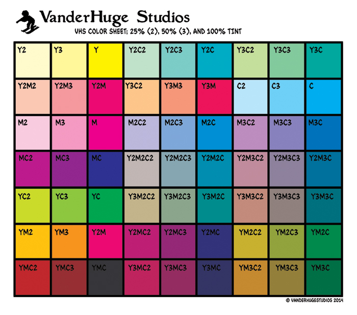
I printed this a while back and have been using it since. All of these colors print about twice or three times as dark as they look on screen. Also, the colors really change when they go through my color process I've hobbled together.
So, today I made and ordered prints of this one.
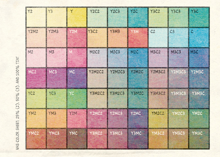
As a better guide for how colors will look in the end.
Places are really weird about printing things (even if you sign all their papers that say you own every single thing on and about the image*), so I removed any reason they could give me for not printing it.
I also ordered a few other prints of a few other finished drawings, sort of as proofs for my non-comic drawing project, and... well, if they'll print those, they'll print anything I send them.
*I seem to recall having the physical drawing with me one time when I tried to pick up prints and they questioned whether I owned the words that were used on it and that they weren't sure whether they could give them to me because I couldn't give proof I made the words I put on it.
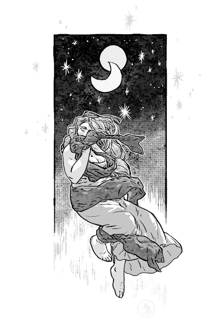
Next post may be about a style inclination I've always had, but never was really aware of. Basically, why I don't like vector drawings, 90's comic boom coloring, and that ultra smooth photoshop concept art painting style that everyone seems to do now, because, you know, that's what everyone does now.

P.S. Also, as a warning to anyone reading this, don't use either of these images, or more specifically, the color selector/picker on them-- these two are web tones, not print. At least not if it matters. The percentages might be a little close, but they'll be off.