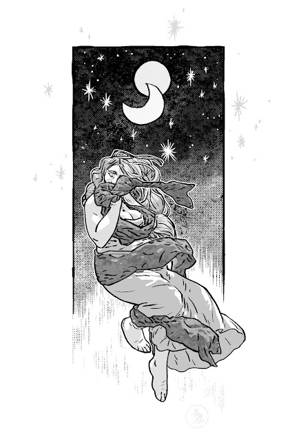
Blurred Lines

Those blue lines looked too perfect (perfect, and perfectly repetitious), so I blurred them a little to soften them. It's my experience that that trick should work. If it doesn't, I can take it back. I won't know if it worked or not until it's printed. (I'll probably enlarge it and print it poster size, that's a pretty good indicator of if it's fine or needs to be reworked)
And this cover isn't the real cover- and it won't be used for anything. I planned to print the book for fun, in sections, along the way as I finished it. But, no one (I can afford for fun) can print 600ppi, or the equivalent, so I'd either have to set up an extra file for each page just for that, that's 300dppi, reworking the tones, or not and there'd be a seriously wicked moiré pattern over the entire page- to the point of the tones being virtually meaningless. So, I decided against printing it in sections, and I pretty much ended up doing this cover for fun.
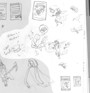
And the EC reference is sort of a moot point now. I was planning on 6 covers, and they were all going to jump through decades and cover styles. So now that I'm not doing them, it's sort of lost.

Another trick, I gave a slight blur to the blacks. It's something that shouldn't be evident on inspection, but should help it as a whole. I've been working on coloring like this for a while, but interior pages, not covers. Pages were printed very cheaply on the cheapest paper, but covers were printed expensively (relatively) on higher quality, glossy paper.
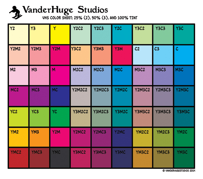
I also used the colors pretty well. I'm making rules up as I go along, and one of the first I made was that I'm only using these colors. For everything. So if I want a color that I don't have, I have to just make it look like it's there. There are a lot of greens that look like other colors, and there's a lot of gray on his robe that looks red, but it's really gray.
So, I'm sort ofstudying trying out color theory every now and then, when I have to.
I also used the colors pretty well. I'm making rules up as I go along, and one of the first I made was that I'm only using these colors. For everything. So if I want a color that I don't have, I have to just make it look like it's there. There are a lot of greens that look like other colors, and there's a lot of gray on his robe that looks red, but it's really gray.
So, I'm sort of

