I hate vector art.
Well... really dislike it.
I feel compelled tosay it point that out.
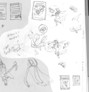
I was testing tracing settings, and this was what I used as a base.

 So close, and yet, so far.
It reminds me of every freshman project anyone ever did. It's really easy to be impressed that you can make perfect, crisp shapes in a fraction of a second, but eventually you need to move on and grow.
For illustrations, it just looks horribly unprofessional. There's no reason to use vector art unless you're making billboards or printing something the size of a car.
And even then, it's not for aesthetics, it's entirely for practicality- file size.
I think peopleforget sometimes don't understand that there's a continental sized gap between what something looks like onscreen and in actual print- especially the higher res you go. It's completely unnecessary to illustrate something small, say, a book, in vector.
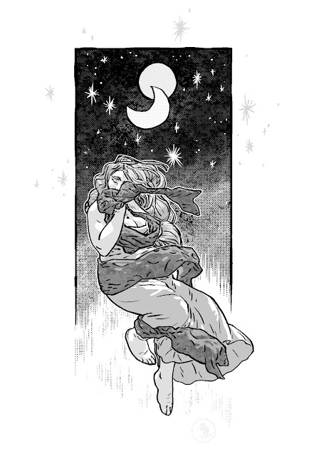
Now, saying all this, I've seen some amazing vector art. The main difference between good vector and bad vector is that with good vector art, you'd never know it's vector. The bad looks like the one above: clearly vector.
Vectoris should be a tool, not a style. Done well, at least.
Note: I'd also like to point out that those two images would essentially print the same... assuming they were printed at their native resolution: about an inch and a half. (notice you don't see a difference between them until they're enlarged) The problem comes when people don't really understand resolution vs vector. I.e., enlarging it; the larger it is, the more clearly vector it would be because the shapes that make up the vector would be enlarged as well.

I feel compelled to
I was testing tracing settings, and this was what I used as a base.


It reminds me of every freshman project anyone ever did. It's really easy to be impressed that you can make perfect, crisp shapes in a fraction of a second, but eventually you need to move on and grow.
For illustrations, it just looks horribly unprofessional. There's no reason to use vector art unless you're making billboards or printing something the size of a car.
And even then, it's not for aesthetics, it's entirely for practicality- file size.
I think people
Now, saying all this, I've seen some amazing vector art. The main difference between good vector and bad vector is that with good vector art, you'd never know it's vector. The bad looks like the one above: clearly vector.
Vector
Note: I'd also like to point out that those two images would essentially print the same... assuming they were printed at their native resolution: about an inch and a half. (notice you don't see a difference between them until they're enlarged) The problem comes when people don't really understand resolution vs vector. I.e., enlarging it; the larger it is, the more clearly vector it would be because the shapes that make up the vector would be enlarged as well.